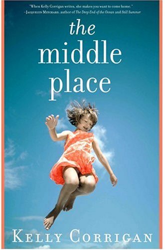
Consider the following:
Come Back: A Mother and Daughter's Journey Through Hell and Back, by Claire Fontaine

And
The Middle Place, by Kelly Corrigan

And
The Hour I First Believed by Wally Lamb

I guess the Madison Avenue big wigs (who certainly know more than I) sit around a big, expensive table and answer questions like, “Hey, I’ve got a great idea – I think pictures of children floating in air will really convey the essence of this book – whaddya think?"


6 comments:
Too funny! They really DO use that a lot in publishing, don't they?
This reminds me of a website or blog post I saw once that showed the same cover image on multiple books. Wish I could remember where I saw it.
Okay, since I have nothing better to do I searched around and found the link to share with you.
http://www.libraryjobpostings.org/reusable-covers.htm
I just finished Wally Lamb's new paperback and still don't understand what the cover has to do with the book. Or why they changed the paperback cover from the cover of the hardback? That cover made more sense to me....
Having read Comeback (& really liked it), that one fits the cover. I guess the Middle Place sorta does. Haven't read Wally Lamb's...do you recommend it?
How funny!
Post a Comment